TomTom My Drive 2.0
Plan anywhere, anytime
-
Client:
TomTom
- Team:
-
Disciplines:
UX/UI, Visual Design, Product Design
-
Schoolyear:
2021 - 2022
TomTom’s MyDrive app was developed years ago to help TomTom owners connect their device to the internet and get the all-important real-time traffic information. But the app is difficult to pair with the device, offers a few outdated functions and is confusing to the users. How can we make it work seamlessly and ensure that the user is fully in control? Can we seize the opportunity to give TomTom customers a better driving experience? How can we keep them engaged longer with the brand they love so much?
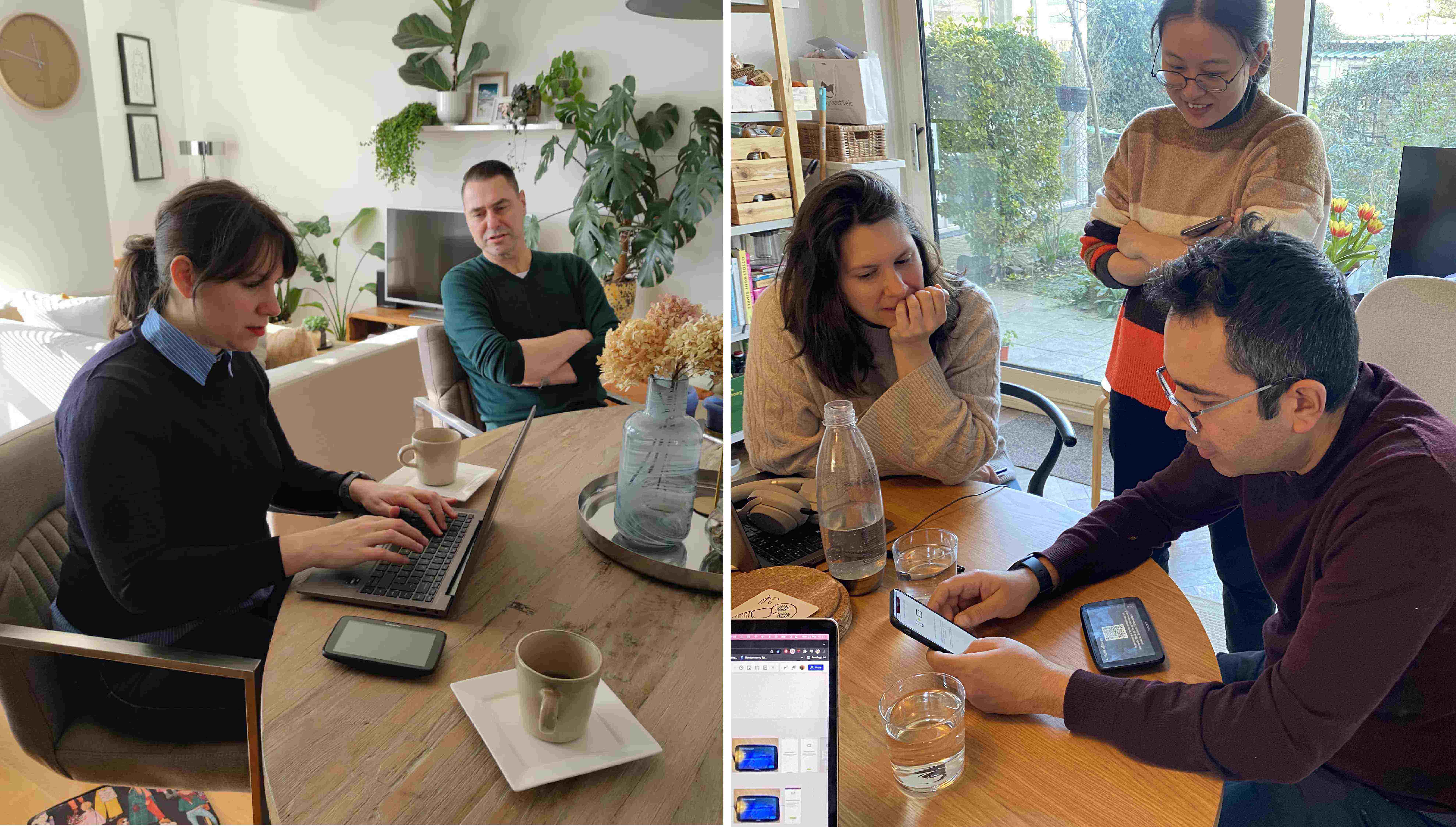
TomTom MyDrive is a smartphone application that enables the driver to give internet connection to their TomTom device via their smartphone's bluetooth. Our challenge was to revamp an existing app and give our very specific target audience, men, aged 45+, who already owned a TomTom navigation device, the best possible experience. This meant finding all the pain points and areas with which we could provide new solutions, while at the same time staying within the brand’s map-making identity. Through extensive research, interviews and situated actions, we were able to achieve this and learn so much more in the process.
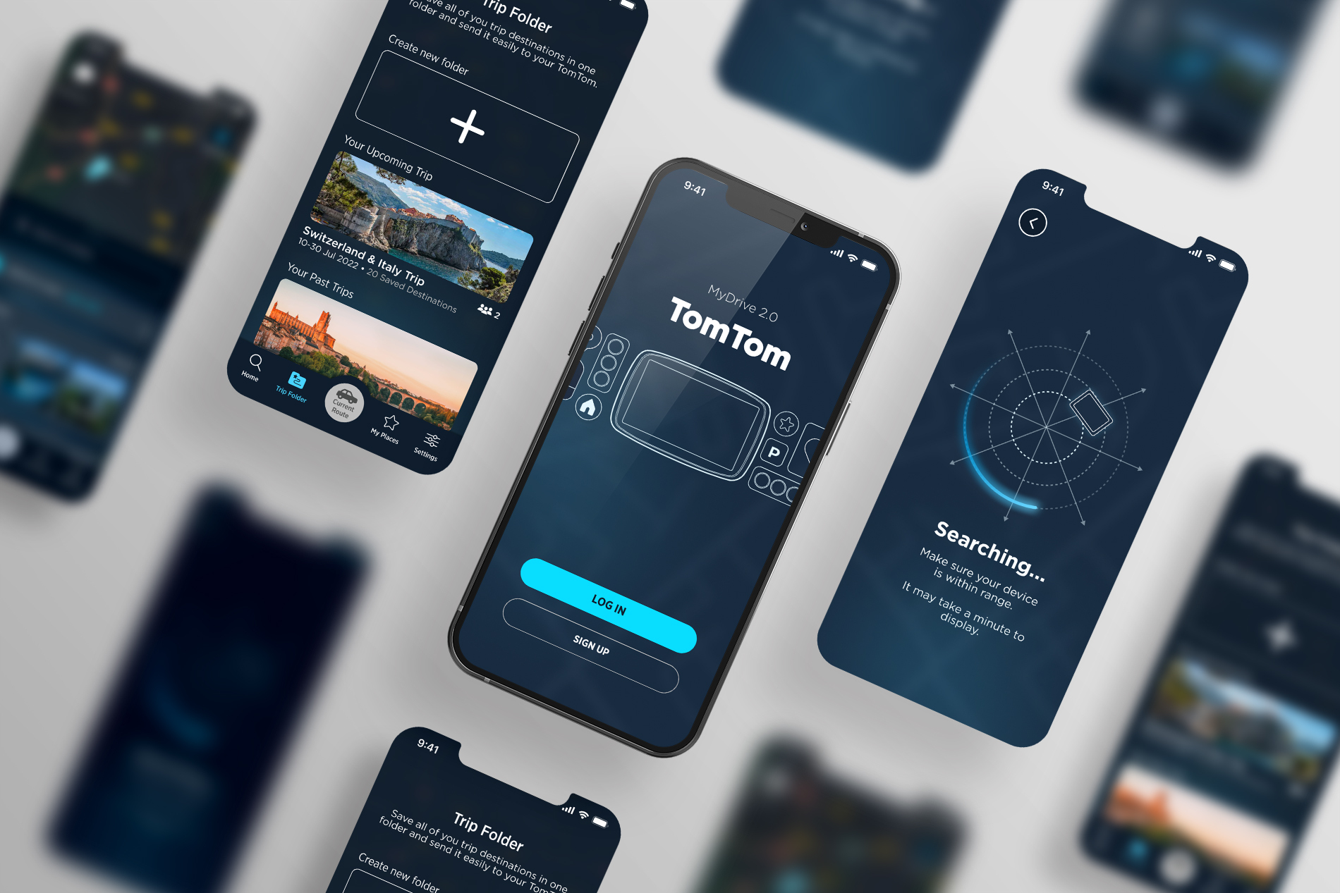
The TomTom MyDrive 2.0 application, is a digital product that offers the driver and their family essential services before, while and after driving. We ensure a smooth pairing process and provide functions to keep the loyal customers happy and within the TomTom family of products.
Traveling Angle
By testing the current My Drive we discovered that the functionality “Road Trips” will be removed from the MyDrive app because TomTom doesn’t want to keep up with the curation of the content.
Through interviews we understood that:
- the users plan their trip months in advance and they enjoy the culture of planning.
- there is a Dutch word to describe joy or pleasure ahead and in anticipation of the actual fun event: ‘voorpret’.
- the target group searches for places to go on their trip from different sources.
- we also found that the target user relies on the service of ANWB (a Dutch road and travelling assistance service) to prepare for holidays.
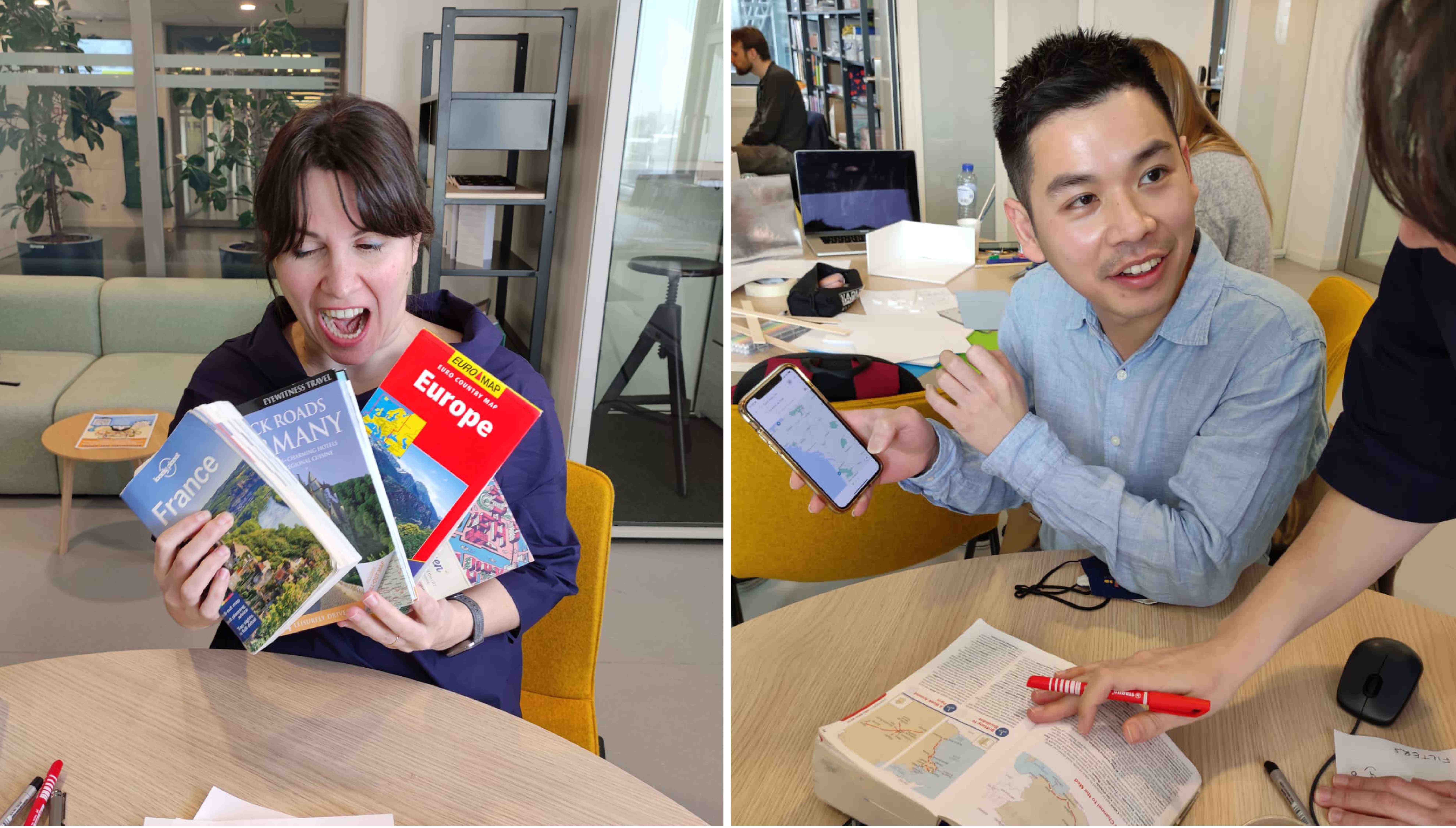
Dutch Travel style = going to ANWB
We discovered that ANWB physical stores are completely dedicated to holiday planning. Visitors purchase maps and other holiday necessities months in advance of their vacation at the these stores. Apart from that, visitors also go to ANWB to get help with creating and organising their travel itineraries.
Other Insights
By observing European past travel behaviours, we identified the need of storing holiday destinations in a dedicated digital space.
Then, according to data provided by TomTom, 90 percent of the company's navigation device users use it to travel to a holiday destination.
Focusing of TomTom legacy & accessibility
Working for TomTom meant we had to constantly keep in mind its customer base. These are loyal customers, buying new versions of the device time after time so they are used to the icons, graphics and functionalities. At the same time, we wanted to make sure our app was fresh and modern. With a target audience up to 80 years old, we had to make sure that the app was legible, accessible and easy to navigate.
User testing in every step of the way
The only way to ensure that our design was successful was to test at every step of the way with the target users. We tested with specific tasks but also with open ended questions on subjects such as navigation, copy as well as desirability and the order of functions.
Introducing MyDrive 2.0
In the final app, we focused and provided solutions for the following areas:
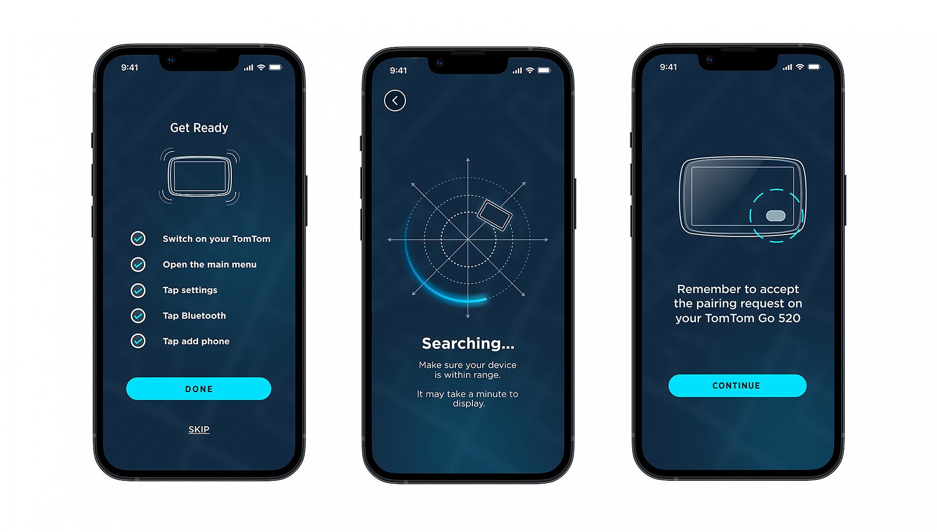
- Pairing - Giving the control back to the user
Through simple autodetection, the phone is automatically paired with the TomTom device. At every step of the way, the user feels confident that they know what is going on between the app and the device.
- Driving and route planning - Revisiting navigation
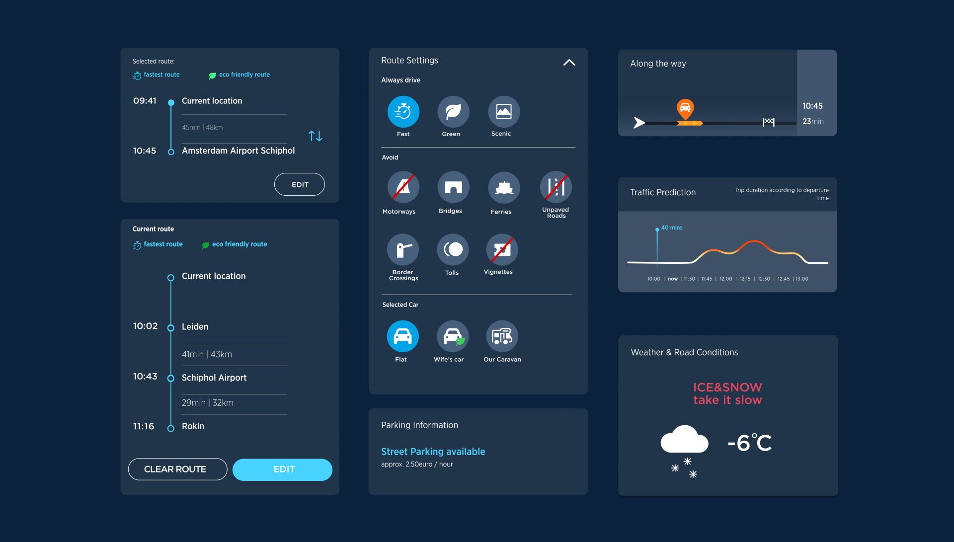
The simple act of finding a destination, choosing a route and syncing this route with your TomTom device, was revisited and designed with the utmost care, multiple user tests and iterations. Special emphasis was given to the function of manipulating a route by adding and re-ordering stops.
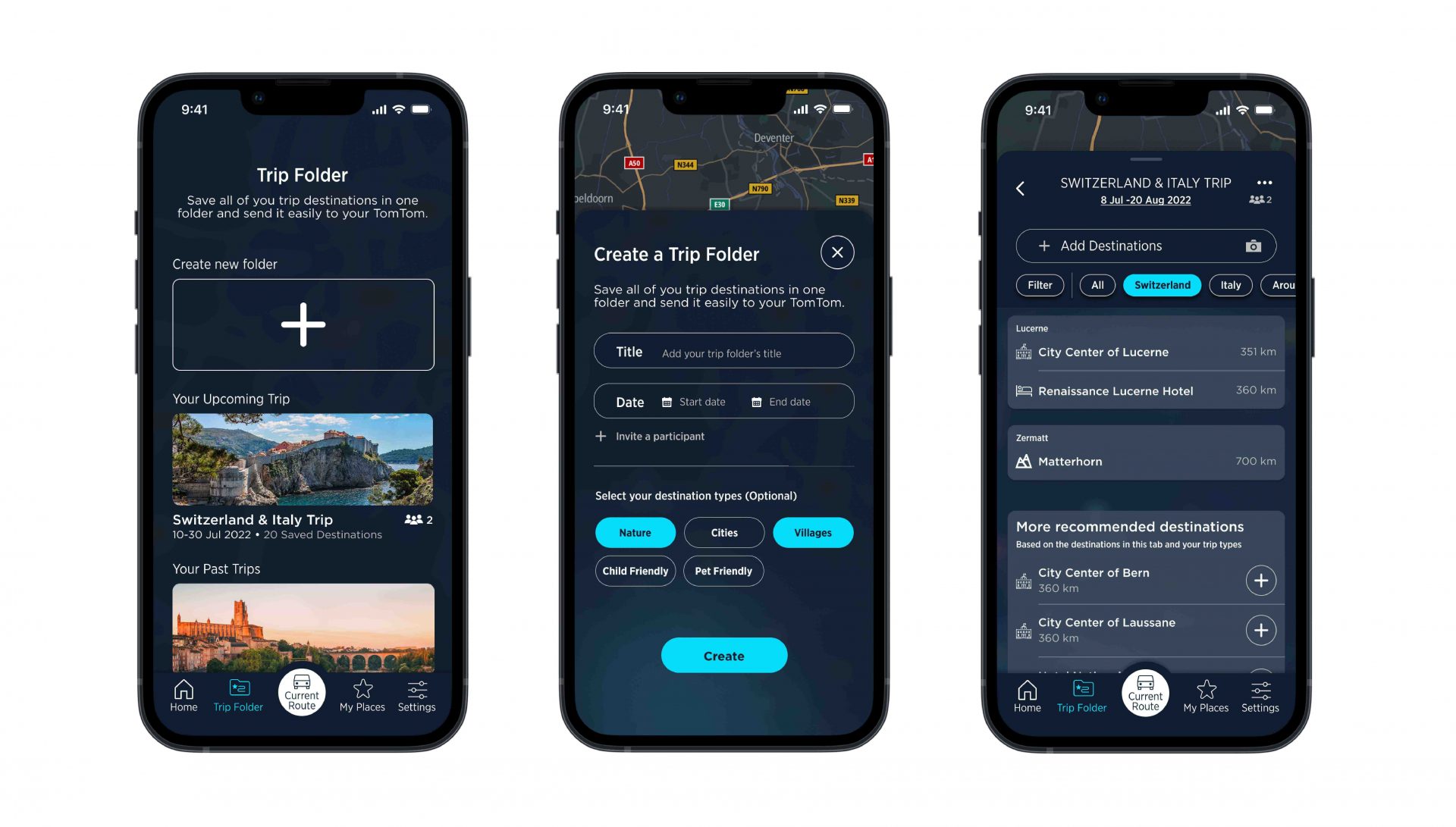
- Trip folders - engage with the brand months in advance
With Trip Folder, users can store desired destinations months in advance and are able to sync it to their TomTom device with ease on the day of the trip. Destinations will be grouped by tabs which are automatically created. The tabs categorise locations by countries, provinces, and cities, making it simple to locate previously stored destinations.
- Passenger - the end to car fights
With MyDrive, the passenger can manipulate the current route without interfering with the TomTom thus ensuring safety. They can also find new locations and use the rest of the functions, even while having a drive synced.
- Traffic checker - smart functions for everyday use
With a system of smart cards, MyDrive can predict your destination and give you traffic information at the time you need it the most.
In the Future
While we realise that the future of personal navigation devices is not as bright as it was 15 years ago, our solution can save a few TomToms from ending up in a shelf. But more than that, the features we developed can be implemented into other TomTom products such as built-in car navigation apps or business to business products.
