Trip-Board
Visual experience to capture traveler’s intent
-
Client:
Booking.com
- Team:
-
Disciplines:
Concept, UX/UI, Visual Design
-
Schoolyear:
2021 - 2022
Planning a vacation is fun - until you actually have to book it. Especially because we are used to being inspired by photos and videos on social media, the dry booking process with search queries and countless filters appears to break the experience. Our concept offers a solution to close this gap and make the booking process part of the exciting experience.
Attention is the currency
We currently see a tendency that our attention has become the most valuable currency of the internet. Due to the vast amount of information, our attention span is getting shorter. This phenomenon is particularly visible in Generation Z. Platforms like Youtube, Tiktok and Instagram thrive on short, digestible content with high visual feedback. The holiday platform Booking.com recognized this trend and gave us the challenge to create a concept that enables young Gen Z users to make the search and filter process more attractive and interactive.
Understanding Gen Z
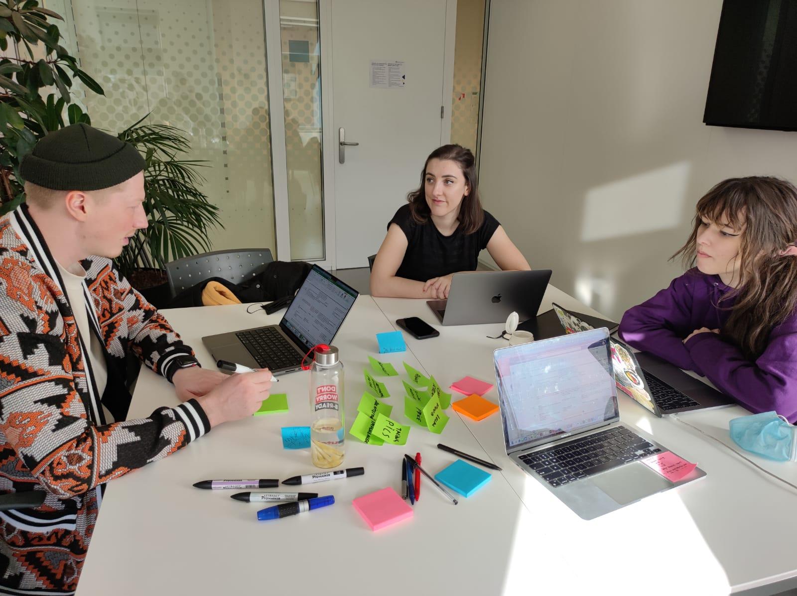
In order to create a suitable concept, we had to get to know Generation Z first. We conducted research on scientific articles that examined the travel behaviour of young people, held many interviews, and looked into current trends. We additionally analyzed the offerings of competitors within the travel industry and tried to see how the search and filter process is structured in other platforms. We also analyzed popular Apps used by Gez Z and their features.
This research phase allowed us to get a more holistic view of the topic and learn from other perspectives. However, we quickly realized that studying the travel behaviour of the 18-24 year old target group is not that easy. Especially since we were very limited in our travel arrangements after almost two years of pandemic, but also because many of them were just gaining their first travel experiences and thus could not yet develop their own behaviour. Nevertheless, our investigations and research were essential and very helpful in building an evidence-based foundation for our concept.
In our research, we were able to identify 5 key points that are the most decisive drivers in Gen Z's online travel planning: budget, visual interaction of the tool, personification and the possibility of comparison. We also saw that over 90% of respondents shared their vacation photos and videos online.
The Trip-Board
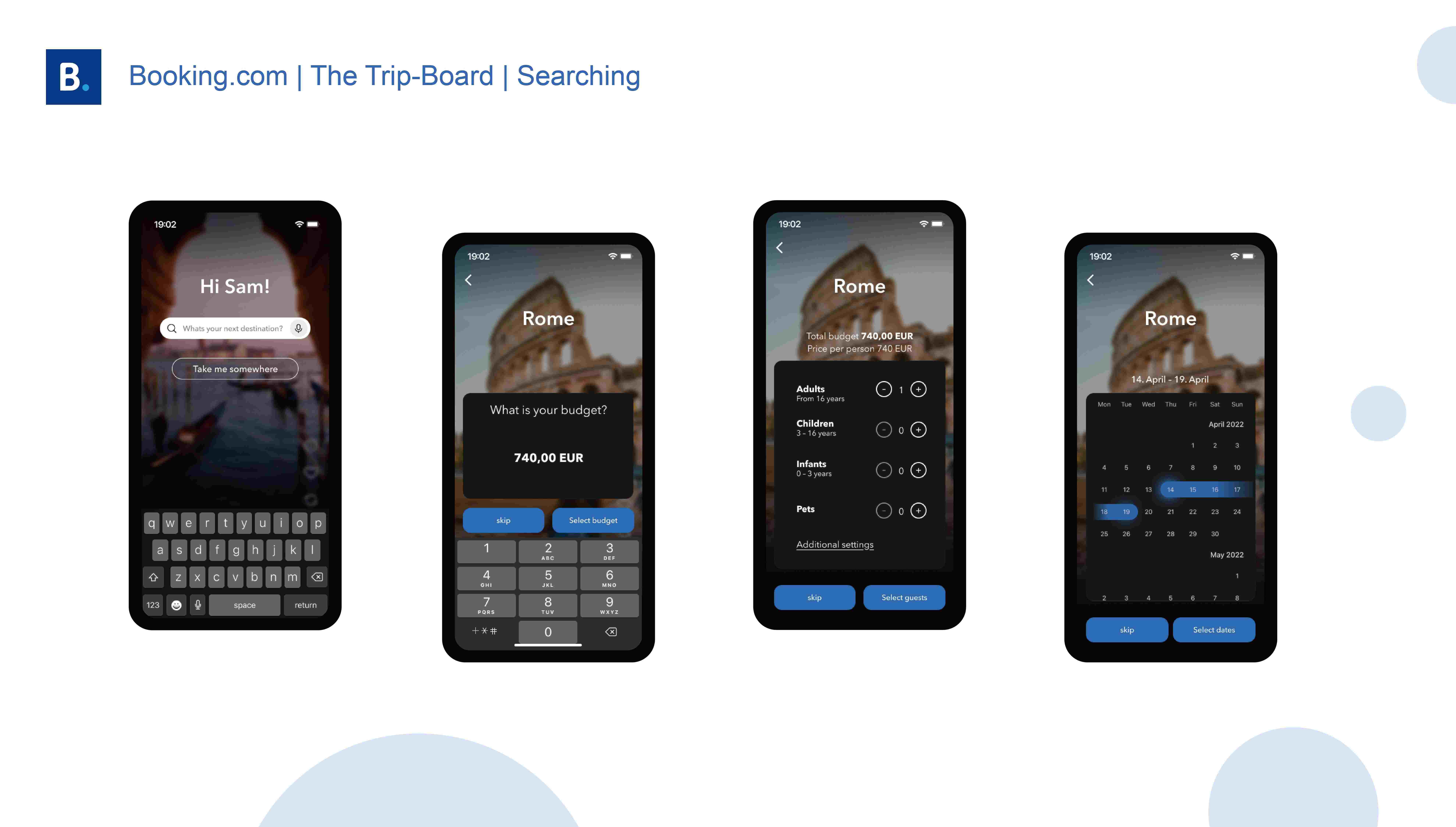
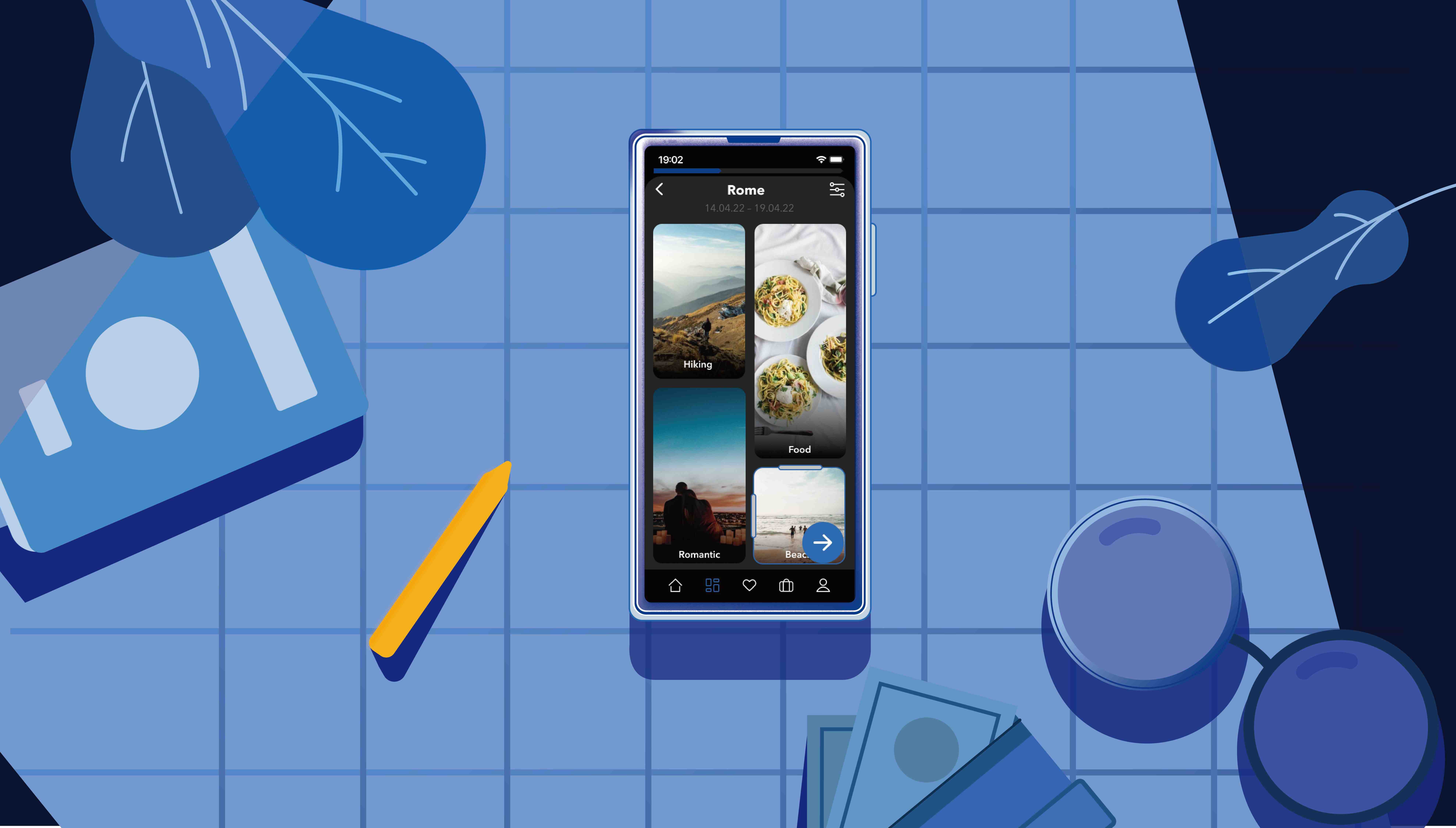
We came up with a highly visual and interactive trip board that allows you to compile your needs and desires individually on one board and thus not only get the perfect suggestions, but also see what your next trip can look like at a glance. The Trip-Board lets you choose from many categories of what you are interested in and what you would like to do on your next vacation. The special aspect here is that these categories are all adapted to the local possibilities and can therefore already suggest concrete activities. These category tiles can then be enlarged, reduced or even removed in the next step, depending on the priority.
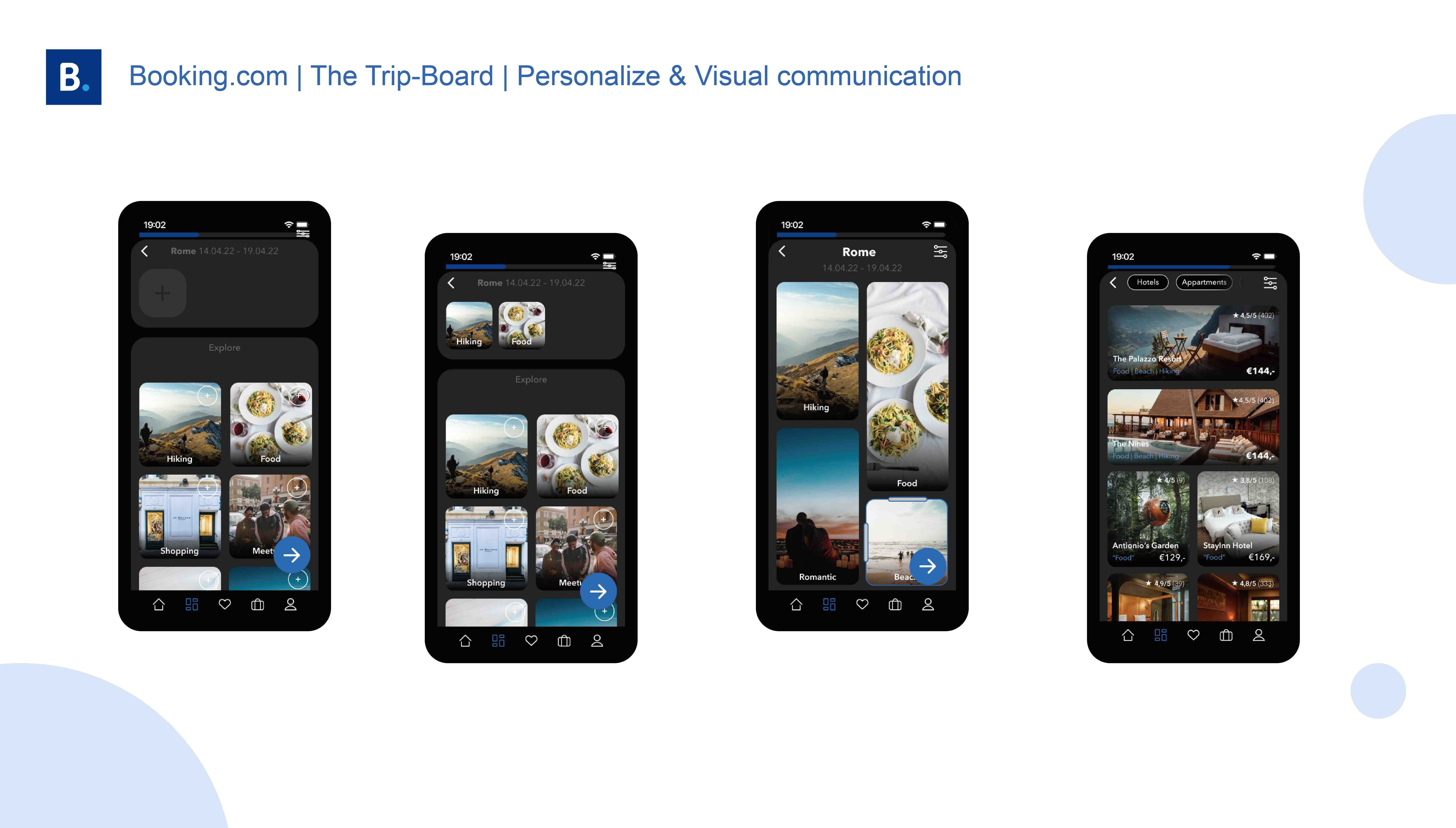
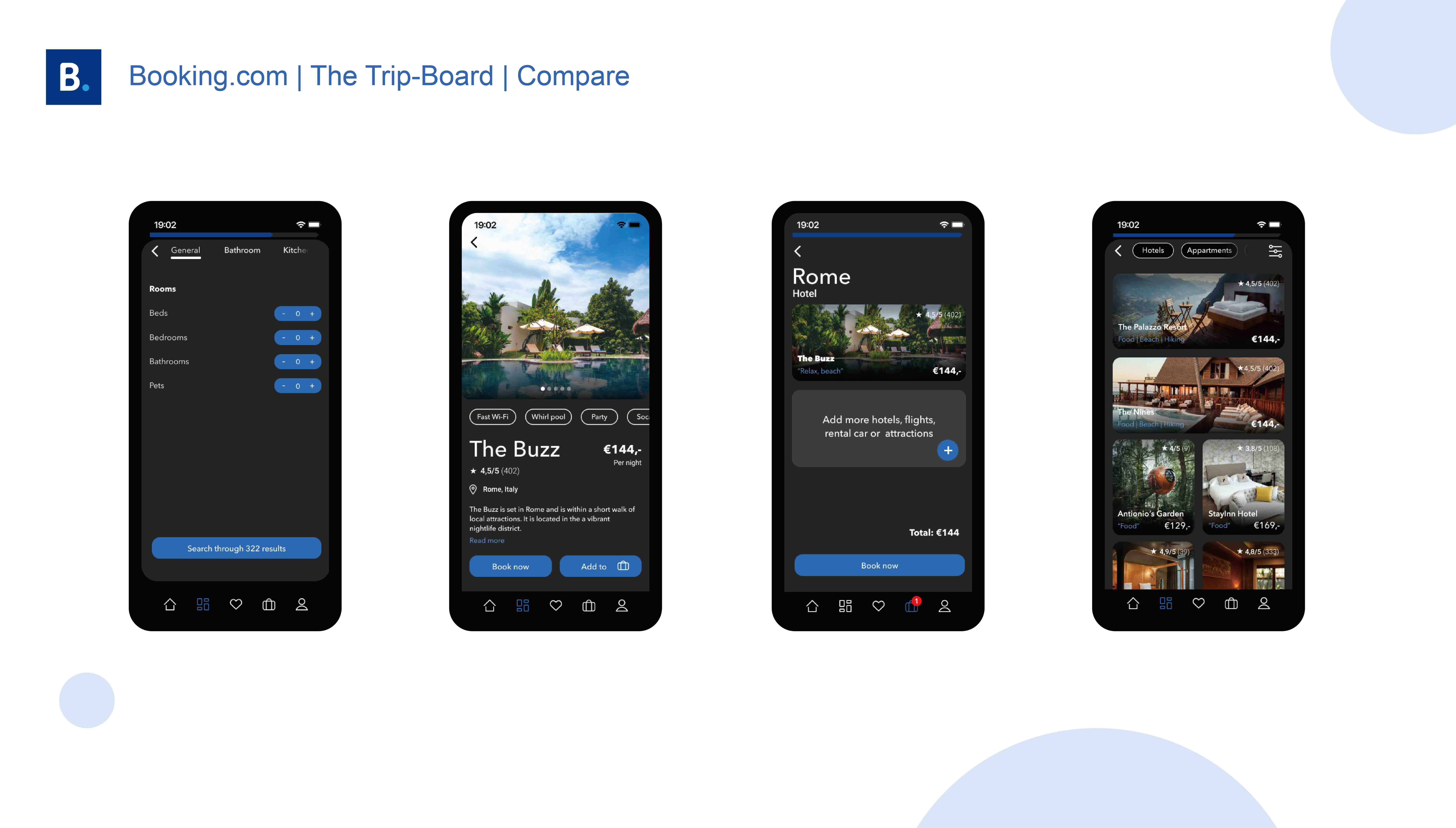
Through many user tests, we were able to sharpen the app experience and improve the essential features. We soon saw that the visual presentation of the categories and the personalization of an own board were very positively received. Especially the possibility to create some sort of shopping cart for the selected activities and thus to have a good price comparison was marked as particularly positive by the testers.
Of course, such a feature cannot be implemented overnight. With the development of this concept, Booking.com has the possibility to further test the functionality and attractiveness. For us, this was an incredibly exciting task, especially because we were able to come up with a solution that is also scalable to many other markets. We got a deep insight into complex information architectures and were able to grow and learn in collaboration with an exciting company throughout the entire process.
