Blog #2: Small Nudges, Big Change
In light of Earth Day (22 April), we are dedicating this whole week to Sustainable UX. We do it so by showcasing some of the good practices already in place and by giving food-for-thought with our own ideas.
Yesterday, we introduced you to the emerging movement in design called Sustainable UX, in which designers reduce their and their users’ carbon footprint by making conscious decisions in their work to promote sustainability. These measures differ from big to small, but all show a certain awareness of digital pollution. Today, we want to show you how small changes in UX can actually make a big difference for the planet.
Designers can use small prompts in their interface to reduce the carbon footprint of their users. They don't necessarily tackle the problem of pollution by changing their content; instead, they present it in a way that allows the user to make better decisions for the environment.
Starting out small
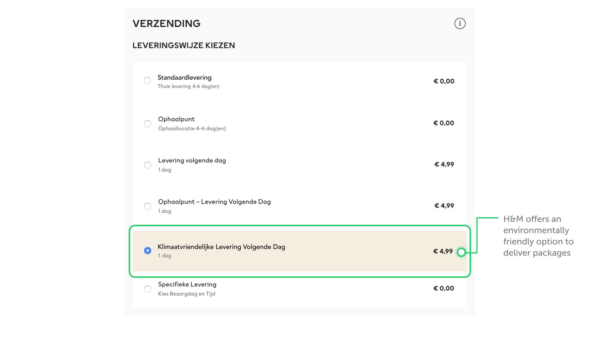
We've seen small nudges into being more sustainable come back in different spots. In December of 2019, H&M introduced a new environmentally friendly delivery method for the Netherlands. For the same price as a normal delivery, users can choose to have their package be transported by a truck that runs on biogas and delivered by a bicycle courier.
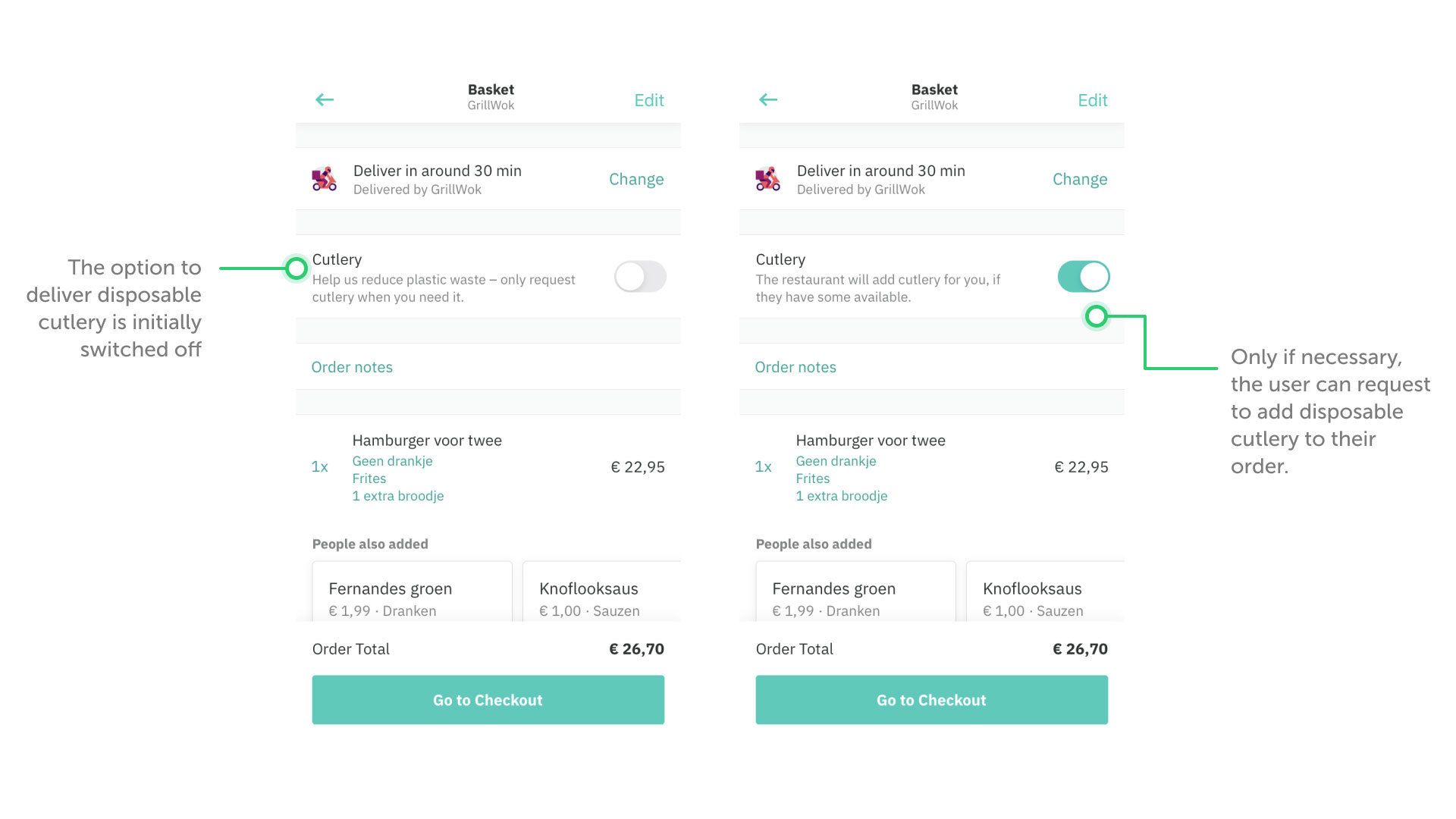
To reduce plastic waste, Deliveroo has introduced an opt-out option of plastic cutlery from the restaurant. Automatically, the option to receive cutlery is turned off with a small text as to why this option would be better for the environment. Users can still decide for themselves if they want to receive plastic cutlery by switching the toggle.
How we could do more
In Artiom Dashinsky's article 'Product Design for Sustainability' (2016), he proposes different ways in which existing interfaces can push for more sustainability. He shows "how small-effort improvements can affect the environment".
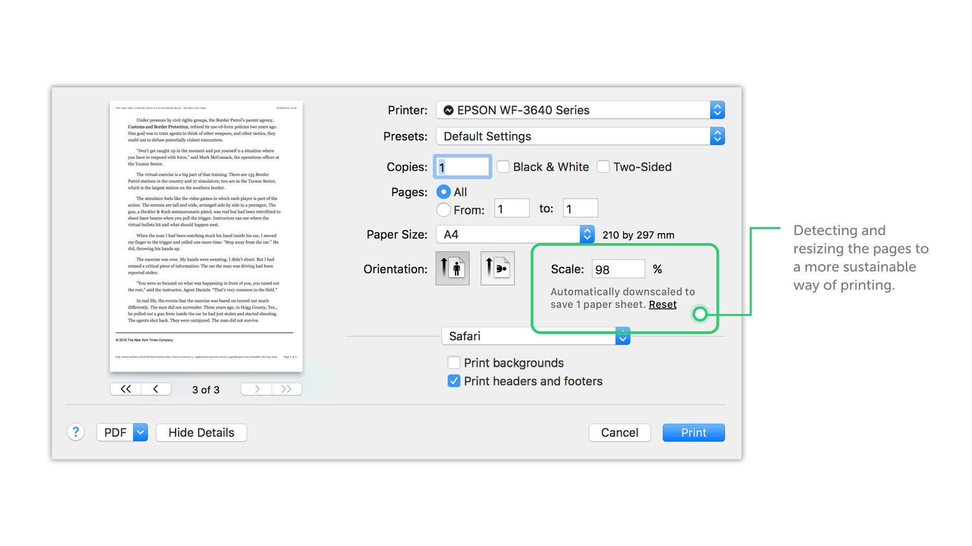
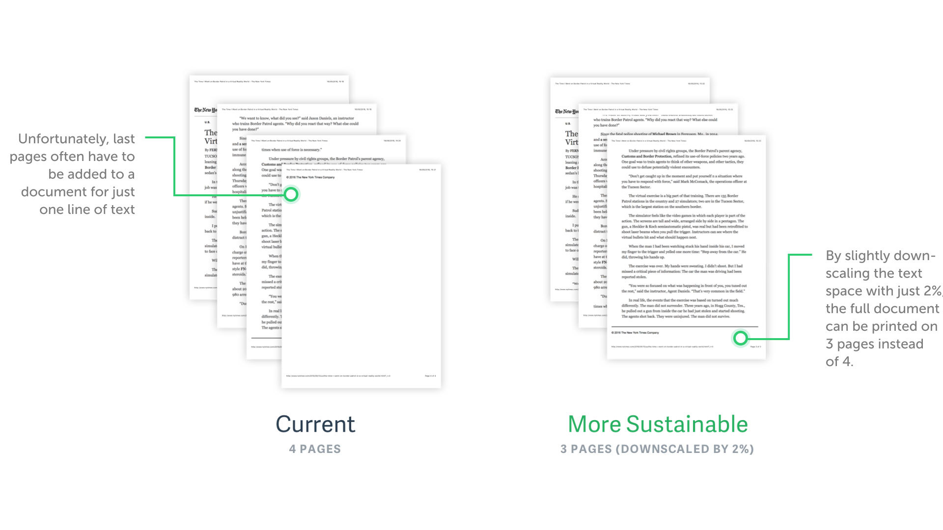
In a first example, Dashinsky presents a more sustainable way of printing documents. Sometimes, the last page of a printed document only contains a few lines. If the interface would give an option to scale down the document (or do this automatically), a lot of paper could be saved.
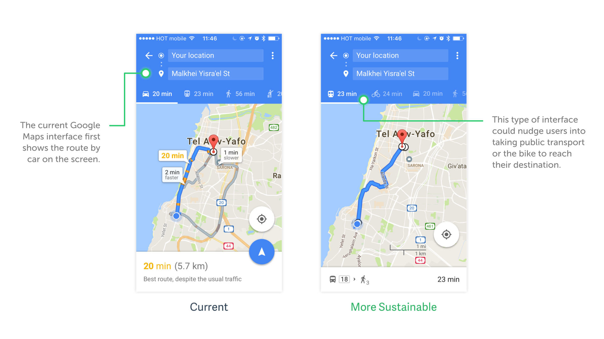
For Google Maps, Dashinsky proposes to present more sustainable options of transport first. If the app promoted public transportation or biking over cars or cabs, people might be nudged into using the prior options, even though they would take longer.
Our Take: Messages & Image Compression
Similarly to Artiom Dashinsky, we challenged ourselves to look at apps we use on a daily basis and think about ways in which we could reduce our own carbon footprint without limiting ourselves in phone usage.
Today, messaging apps go beyond the simple text message. We're constantly sharing data with others: from emojis to short videos. We love the fact that our contacts receive this data within a few seconds. But we probably forget about the real impact of this data-sharing.
When you send content, like photos, through WhatsApp, it is automatically compressed. To the average user, this compression is visually unnoticeable. In contrast, images through iMessage are sent in full resolution. Even a random selfie to your best friend is sent in an unnecessarily pixel perfect quality. This requires extra computational energy resulting in a higher impact for the environment.
45,000,000 images sent through iMessenger every day
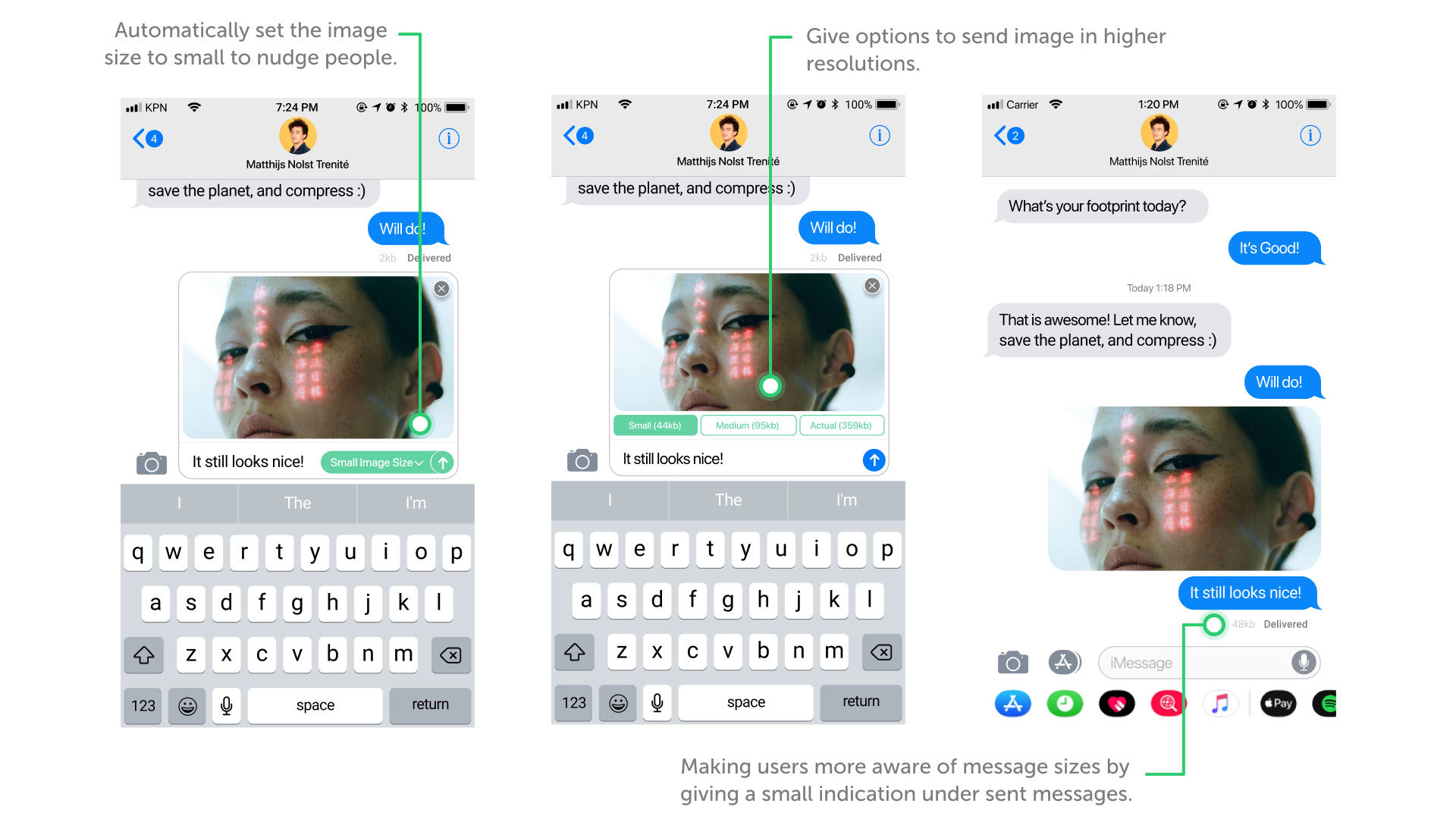
Taking inspiration from WhatsApp (automatically compressing photos) and the Apple Mail application (giving users the option to compress mail attachments), we created a small UI change for iMessage.
Our suggestion provides the user with different size options in which they can send their photos. We decided to leave the choice of compression to the user because, sometimes, people still want to be able to send photos in full size and not lose any quality. To nudge people into sustainable behaviour, the smallest picture size option is automatically selected. Users can change this selection by simple clicking the option they would prefer.
Does such a small change in UX make any difference on a larger scale? Let's run some calculations.
According to research on Wonder (Wonder, 2016), an average of 1.8 billion digital images are loaded (globally) each day. Unfortunately, the percentage of images sent with iMessage is unknown. To make an estimation, we will use WhatsApp's statistics as a placeholder: 2.5% of the messages sent through their service are images.
The latest data shows that users of iMessage sent 800 billion in 2013. So, that would mean 45,000,000 images sent through iMessenger every day.
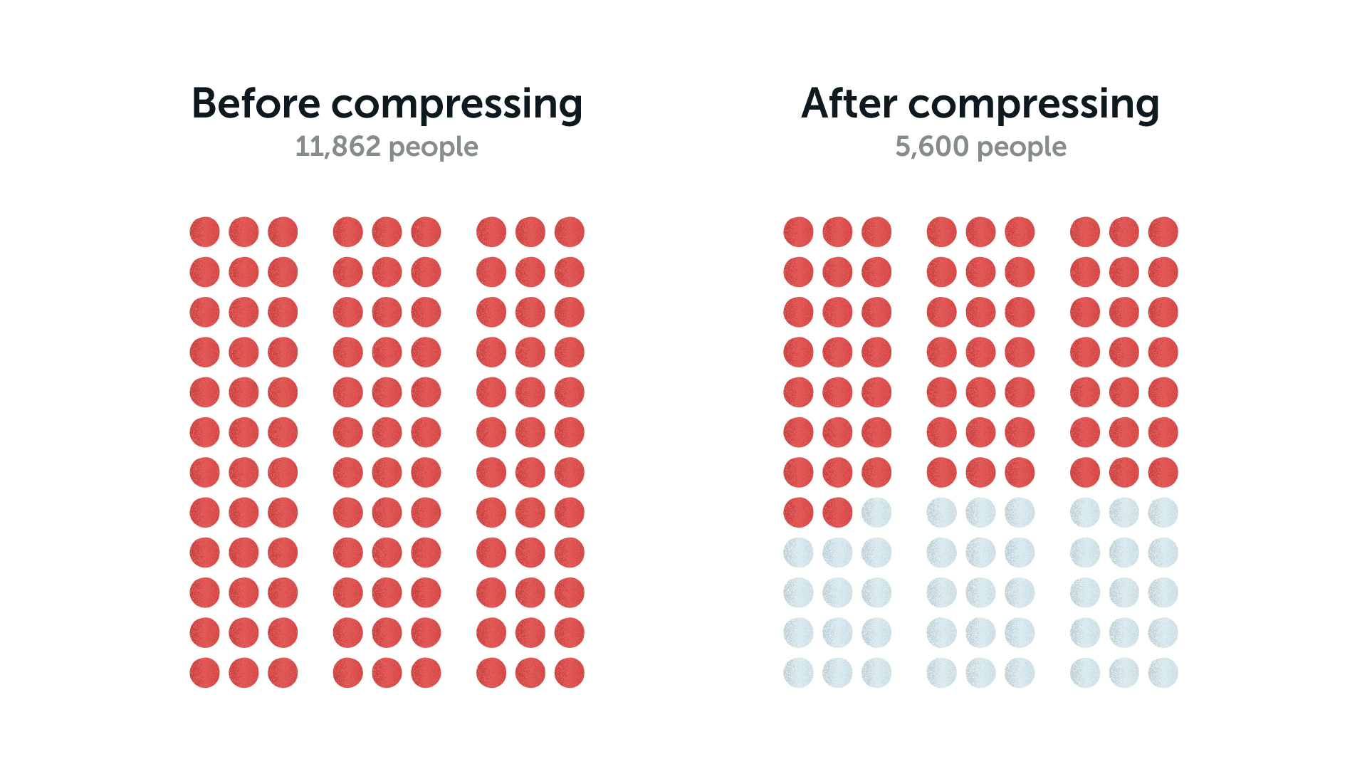
The CO-2 emitted from the images sent through iMessage each day is equal to 11,862 people flying from Paris to New York.
Taking the average size of phone images (13.18 MB (S. Hollister, CNet, 2015), this brings us to a total of 593,100,000 megabytes worth of data sent each day, or 593.1 terabytes. With this, we emit 11,862 tons of CO-2 per day, equal to 11,862 passengers flying from Paris to New York (Energuide, n.d.).
By compressing the images we send, we can bring this number back by about 40%. The rate of a JPG2000 compression is 1.72, which would make the total amount of data shared 345 terabytes. We could even take it a step further by using an AI-based compression. This could further reduce the data to 280 terabytes a day. Instead of 11,862 people taking that flight from Paris to New York, it would be around 5,600. All of these calculations are based on the paper 'Integer Discrete Flows and Lossless Compression' (Hoogeboom, 2019).
Friction vs. Seamless
As mentioned earlier, WhatsApp compresses images automatically, keeping the user out of the process. This is, partly, a financial consideration. After all, smaller picture sizes mean fewer servers, which means fewer running costs. This can be an important factor for a company that pays for their own servers while running a 'free' product. But, an even bigger consideration is that of design friction. Friction is anything that prevents users from accomplishing their goals or getting things done as quick as possible. It is usually the opposite of being intuitive or effortless. However, it doesn’t mean that it’s always bad for users.
Are messaging apps supposed to hoist the sustainability flag?
iMessage and WhatsApp are all about seamless messaging. Sending a picture just works. Adding an extra interaction to stimulate sustainability adds an 'unnecessary' friction to that experience. But maybe this 'friction in the experience' is exactly what consumers need.
Up to now, consumers have not typically considered the computational energy needed to deliver their messages. The whole product is organised so that the end user doesn't have to care. By adding an extra interaction, you could let users realise that there is a downside of sending an image — you can make them aware. The question then remains: Is a functional messaging product like iMessage or WhatsApp designated to spread such a message?
Text by Danique de Bies & Kent de Bruin. Illustrations by Matthijs Nolst Trenité. Filter and calculations by Gabriela Onu.
