Designers, (Don't) Make Me Think!

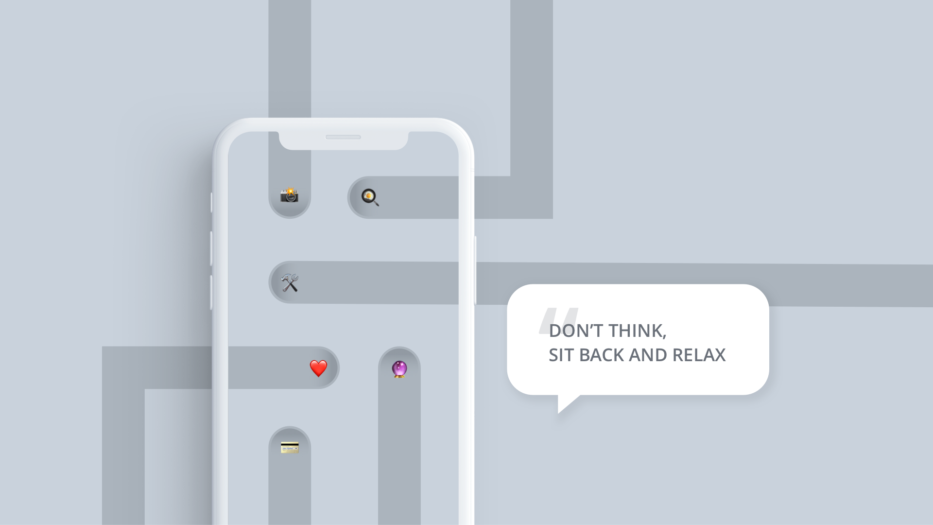
What are we designing for? During most of my education as a designer I have been taught to design for ease of use. 'Don't make the user think' was lesson number one. Over the years, however, I slowly started realising that, with our design decisions, we shape the future. Do I want to design (and live in) a world where nobody needs to think? What does that even mean?
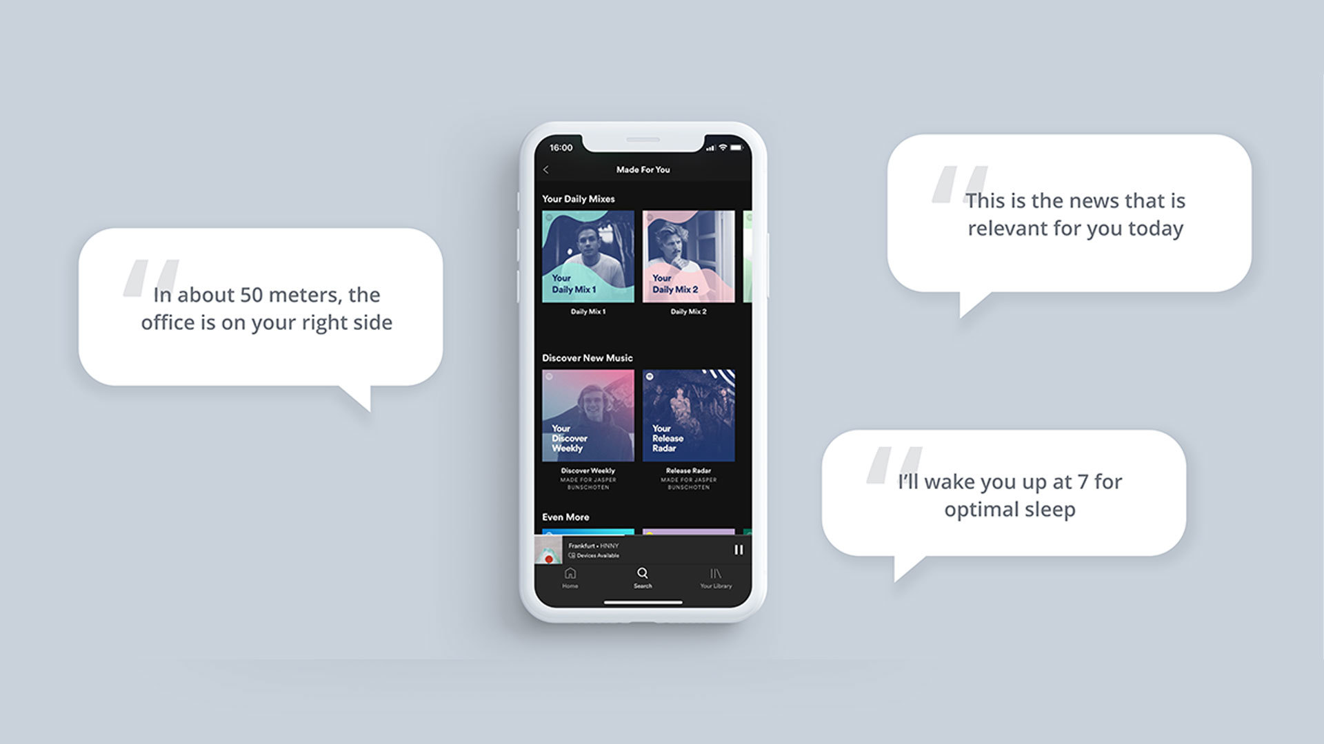
When I look at current technology, I see that this is the future we’re currently moving towards. If I want to listen to music, an algorithm selects a track that fits my mood without me pushing a single button. The same happens with getting the fastest route to the office, the optimal time to wake up in the morning, and the most important news to read.
Digital technology has the ability to make our daily routines easier than ever. Every new product coming from Silicon Valley promises to make our lives more seamless. But does ‘seamless’, by default, mean better?

Meaningful moments
Let's think about the most meaningful moments in our lives. Picture them right in front of you. Now think about what made these moments so meaningful. It's a wild guess but probably it were not the things that were easy and seamless.
For me, the moments that are most meaningful aren’t the ones I had while I was on a Netflix binge or when I conveniently had my favourite food delivered to my doorstep. My most meaningful moments are full of friction: they were difficult and they taught me something. For example, the period I was sick and found myself in hospital for weeks. That experience taught me to cope with uncertainty, appreciate what I have, and acknowledge my vulnerability. Things that gave shape to who I am. There were no smart apps or software involved into making it meaningful: it was me finding my way to deal with difficulties that made these moments so memorable.
It’s in the Small Things
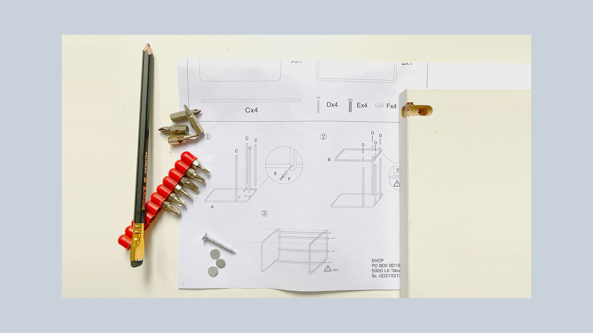
Meaning doesn't always have to come from big struggles. Also small amounts of friction create meaningful value. Take a look at the Ikea Effect [1]. Researchers Michael I. Norton, Daniel Mochon and Dan Ariely found that the more effort you put into constructing an object, the more value you attach to it. An Ikea closet that you put together yourself is worth more to you than the exact same closet that was pre-assembled. Spoiler: this isn't limited to Ikea furniture. Why do you think homemade apple pie tastes so much better than the one from the supermarket?

The same principle, as we’ve established, applies to digital products. Modern frictionless technology aims to make things easy and fast. It attempts at not making the user think. The risk of doing this is that we might turn these unique meaningful moments into rather hollow consumer experiences.
Slow Down and Pay Attention
A frictionless experience has the power to let moments of decision-making disappear. How often have you caught yourself mindlessly scrolling on your phone while the only thing you wanted to do was check the time? A bit of friction can slow us down and consider our intentions.
These ‘slow moments’ give people the chance to consider the consequences of their actions: "Do I really want to pay €30 for a new t-shirt?", "Do I really want to spend the rest of my evening watching this series?"
Contactless payments is a clear example of frictionless technology. It has become so easy that we simply don’t have to pay any attention to it. The result? I often don’t even know how much I just paid.
The slow moments in which I have to pay attention force me to be ‘in the moment’
Digital photography also illustrates how seamless experiences impact the value of a moment. When I find myself using a digital camera, I tend to spray and pray. I'll just take three pictures from this angle and a few more from the other, so I'm confident to have at least one good picture. In contrast, analog cameras make me pay attention to every single photo. The friction is in the limited number of frames on a roll of film. That is why I want to make every single one of them count and really pay attention when I look around, compose, focus and shoot. As a result, there is far more value for me in the few analog photos than in the hundreds of digital ones.
Not only the results of my actions become more valuable, but the action itself becomes better as well. The slow moments in which I have to pay attention force me to be ‘in the moment’ - an experience many people are looking for but have a hard time finding. Let's not forget about the value of slowing down and paying attention.
So what?
One could argue that it's up to the user to decide whether they want to use convenient and frictionless products or not. But one must ask whether we (designers) are even providing such alternatives. As Tim Wu mentions in the New York Times [2]: "Convenience has the ability to make other options unthinkable". Why would you read a book when you can also listen to a summary of it? Then there’s also the technology that is embedded in public spaces. This is technology that people can’t choose not to use. For example: some public transport systems don't allow cash anymore. The only way to travel is by using a special chip card.
It's not just the responsibility of the user. If you, as a maker, put something out into the world, you have to take responsibility over its consequences.
As designers we help shape the future. We influence the direction in which technology develops. This technology will mould the behaviour of people and, therefore, of society as a whole. So we should ask ourselves: what kind of society do we want to build? My suggestion is to stop seeing frictionless, seamless, and convenient experiences as the holy grail. Instead, let’s focus on making understandable experiences that support meaningful moments.
[1] Norton, M. I., Mochon, D., & Ariely, D. (2012). The IKEA effect: When Labor Leads to Love. Journal of Consumer Psychology, 22(3), 453-460.
[2] Wu, T. (2018). The Tyranny of Convenience. The New York Times.

