Harald Dunnink: “What I like mostly is when design cultivates calm”
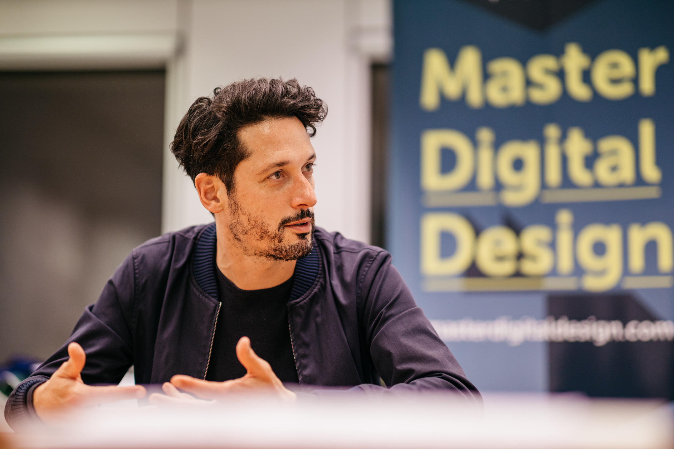
How do designers find and shape their own design philosophy? In this interview, Momkai’s founder and co-founder of De Correspondent, Harald Dunnink, sits down with student Beatrice Neacsu and alumnae Matthijs Nolst Trenité to discuss all things design: from his calm philosophy to meaningful membership experiences.
What does design have to do with journalism? At first, the connection seems meaningless but Harald Dunnink has built a bridge there. The news organisation he co-founded has proved pivotal to the way he designs.
Following a talk at our programme's Studio, Harald sat down with us to share more about his work at Momkai and De Correspondent.
Beatrice & Matthijs: Momkai is presented as a "creative force for strategic questions surrounding memberful initiatives". What are these memberful initiatives and why are they so important to you?
Harald: Memberful initiatives are a way for us to be talking about meaningful membership experiences, the idea of a community, people that stand behind a cause, how they can be part of an organization, startup or company. And a way to be sure that you have a community that is connected with it. We noticed over time that membership is a very helpful tool for that because it creates recurring revenue. It's a way for an organization to have a very clear focus: who are we making this for; what are we doing for them.
We noticed that talking about it from a meaningful way is very helpful for the people that sign up. It's not so transactional, which can be very one-off: I buy this thing and I go away; but rather, I'm really supportive of a larger cause. It's a way to be creating the right foundation for an organization: who are we making this for, who is supporting us; and for members: why am I supporting this and what is it bringing me.
B&M: So is that important for you because of the philosophy behind this initiative?
H: Memberful design is important to me when it is a way to something that is a just cause, like cancer research, journalism or sports. Something that is often also a bit more vulnerable. And that I know that is a way to tie the community together, create more focus, create better stories and get a more engaged community. In that way, either solve complex cancer research questions sooner or when it comes to journalism, understand the world around us better or create more empathy. To be designing this, you also design a way that the organization can have a lasting impact, exist longer.
B&M: In 2016, you introduced the design philosophy of calm. What is it all about?
H: The idea of it is to cultivate calm so that only the content can drive you to distraction. Meaning that, whatever we do in design, we are aware of how it is perceived by the visitor, by the member, by someone engaging with it, in a way that is frictionless and that puts them at ease. It still can be vibrant and have lively colours. It doesn't mean that it all has to be subdued, but it means more that I get distracted by the right thing. For instance, take journalism: if you have a story, you give it a centre stage, you put a spotlight on it. My work is to make sure that you can actually read that story and you are engaged with it. The whole design is there to contextualize what I'm reading and give me a better understanding of the subject. If I get distracted, if I get a bad feeling, it's from the content itself.
You could also view it as a theatre. We create the centre-stage, we make the best spotlight, the mic is very good, I make sure that everyone who gets into the theatre is comfortable, that it is a very immersive experience, but I don't know what someone will sing in that mic or what kind of play they will perform on that stage. I create the theatre, so to say, and then, in that way, I hope it can be calm and that you can trust it.
Calm design is very much about designing for trust. If you are very consistent in your design and create a calm experience, people feel at ease and they can recognize the brand and see that it all ties into one holistic brand experience. If you do that well, especially in journalism it is very important, then it creates trust.
B&M: How did the philosophy of calm take shape? You mentioned at some point that you didn't call it like that at the beginning.
H: Before, it was internal. In Dutch, it is "rust"; in English, "calm". I wasn't even aware that I would call it like that but I would say: 'This is so "onrustig"'. That would be in Dutch: this is so distracting and fuzzy. And then, I was asked to do an audio tour in the Stedelijk Museum - that's the contemporary art museum here in Amsterdam - and it was a really fun project. They said: you can select 10 works, do an audio tour and explain why you selected each of these works. And while I was walking through the museum, I discovered that what I liked about it was the museum itself, the building. The idea of this design that's completely there to make sure that here in the museum, all of a sudden, we pause and we look at one image. And this is designed in such a way that, for example, you don’t see power sockets. The walls are designed in a way that the power sockets are covered. All these details are there to get rid of distractions, to make sure that you are focused on one item.
I noticed while walking through the museum that this approach is actually essential to my work. This architect is doing that in real life, creating some sort of stage. Then I realized that that feels much closer to what we do and I noticed all the works that I was choosing were all around this subject matter of calm. What I like mostly is when design cultivates calm.
I presented the philosophy for the first time in the Stedelijk Museum. They said: you can organize a night at the end, when you do the audio tour. I thought: Oh, that's cool. I used that opportunity to share the philosophy and now you can say the philosophy was launched in the museum. It sounds really fancy. (laughs)
I think without trust you can't really have a collaboration.
B&M: You’ve done a lot of cool stuff but is there an ultimate stage you want to build?
H: I think it’s not so much about an ultimate centre stage but I hope to be able to attract or to discover or find time and time again people that I can help by giving that little push. Or an organization, maybe an old organization, that I can help by giving that push to become more memberful.
B&M: We live in a world in which so many values are reshaped, renegotiated constantly, and for designers, it is a big topic that they need to keep up with. So, I was wondering if there's one value that you really couldn't negotiate, that you would stick to it and you wouldn't be able to work on a project without it.
H: I would say that's trust. You can't work together in any way if there is no trust. I think trust is always the most important. You can design for trust, create consistency, but it is also what you ask from your team members. I am a strong believer that people can do more than they believe they can do, so I think there's always more creativity or maybe that someone that is designing is maybe also a good photographer or maybe they like illustration. I try to give trust to people that they can excel. And sometimes you have to trust that they do the right thing. Maybe they make a mistake, but that's okay. Yes, I think without trust you can't really have a collaboration.
B&M: How do you make sure you hit the heart of the client?
H: I think there's always a bit of a challenge. Sometimes it can be a guessing game; and sometimes, for certain clients, it can be hard to understand that part of designing is that your heart is in it. There's always something of yourself in a design and it's always a bit of a challenge. But overall, you must be really curious. If you're curious, then you will hit the heart of the client. It helps to ask a lot of questions to see what drives them. I think this is one of the most fun things to do. What people from outside of our work field not often see is that you have a license to just jump into any kind of world. This is something I really like about working with clients.
B&M: One thing about De Correspondent is that you co-founded it without a client. Do you think it is important to do your own projects as a designer?
H: We like to help dreamers and thinkers to realize what they want to achieve. I always want to approach it as equals, I don't want to be better than anyone and I don't want to be lower than anyone. I'm just the expert on this kind of topic and then another person knows more about other things. I like to work with organizations or partner up with people. I noticed that, if I'm selective and if I get enough opportunities to be able to go from zero to one, then I'm happy.
B&M: De Correspondent seems like a quite timeless design. But how do you design timeless in a fast-moving digital world?
H: I think what we as a designers, often do, is to come up with a system. I think that's the most fun. If I do this and this and it clicks, it becomes a sort of LEGO, you can keep on building. For example, with De Correspondent, you see that the correspondents all have illustrated faces. That was a way to ensure that everyone becomes unified because they're all illustrated in the same way but they're still expressing their own personality. It's not as direct as a photo, because it's an artist's impression of the person. And at the same time, I don't need a photographer going to all these people to do a portrait but they can make a snapshot and the illustrator just makes an illustration of that person. Actually, the costs become much lower. And I can now use the portraits without De Correspondent’s branding next to it and you would still recognize this as De Correspondent. It's coming from a sort of system-approach.
Try to find a system and try to find how you can be the odd-one-out in the design. For example, when we started to design the logo of De Correspondent, it was handwritten, so no one could steal that, and it had all these pastel colours, which were very unusual for news at the time. In that way, you find certain elements that make you stand out. And what you notice is that the pastel colours were really of that time; if you would see them now you say that this really was 2013/2014. But what you see is that the core elements, like the logo and the illustrated face principles are timeless. It's really fun to see. Even to us the timelessness is surprising. We just did the audio app, and if you would download that, you see that the correspondents are all wearing headphones. The only thing that we asked the illustrator was if she could illustrate one headphone. And the headphone is just a transparent Photoshop layer with which we can put this on all these faces. It really came to me from all the Zoom calls: I saw everyone with those massive headphones. I think that's something of this time. We did change the illustrations over time, with the skin colour to be much more inclusive. I think we improved there. But the core concept stays the same. It's just a little system.
